


When defining a brand, its identity is often recognised before it is explained. The ILLIYEEN Monogram Edition builds that recognition through a thoughtful design language that connects every style in the collection.
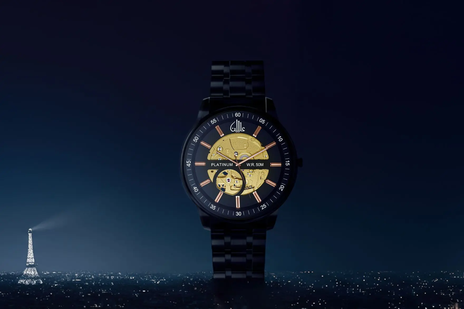
A stylised interpretation of the brand name shaped into a refined graphic form influenced by Arabic script is the ILLIYEEN Signature, this adds distinction to the overall design, allowing each attire to feel individual while contributing to a cohesive and instantly recognisable collection.
Origins of the Monogram
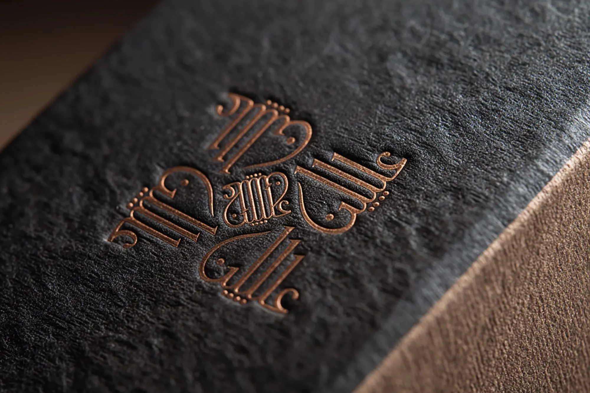
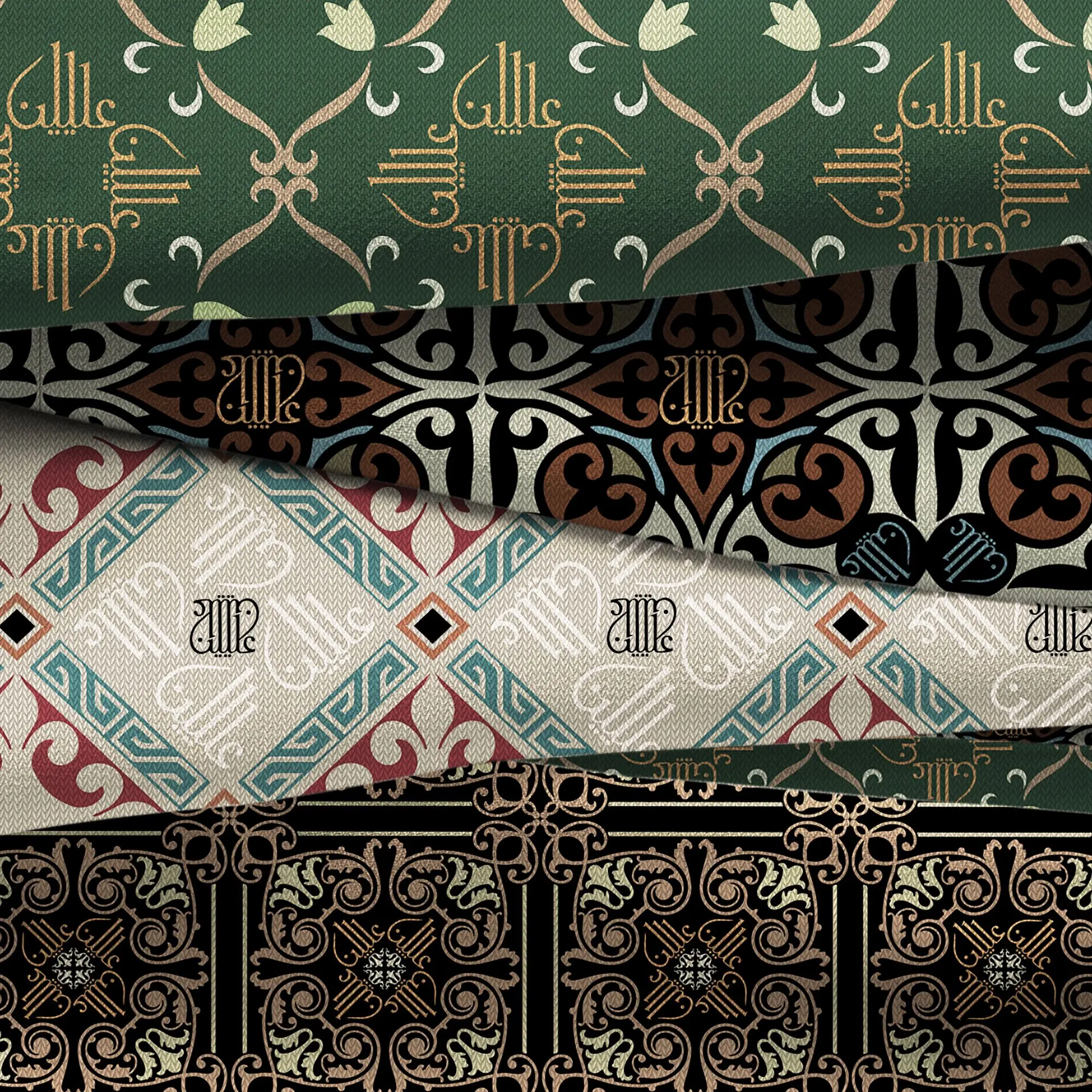
The Monogram used throughout the collection originates from ILLIYEEN’s own calligraphic signature — a graphic form created by merging letterforms into a unified motif. Rather than presenting the name directly, the design abstracts it into a symbol that balances readability with ornamentation. The result is a mark that operates simultaneously as branding and pattern.
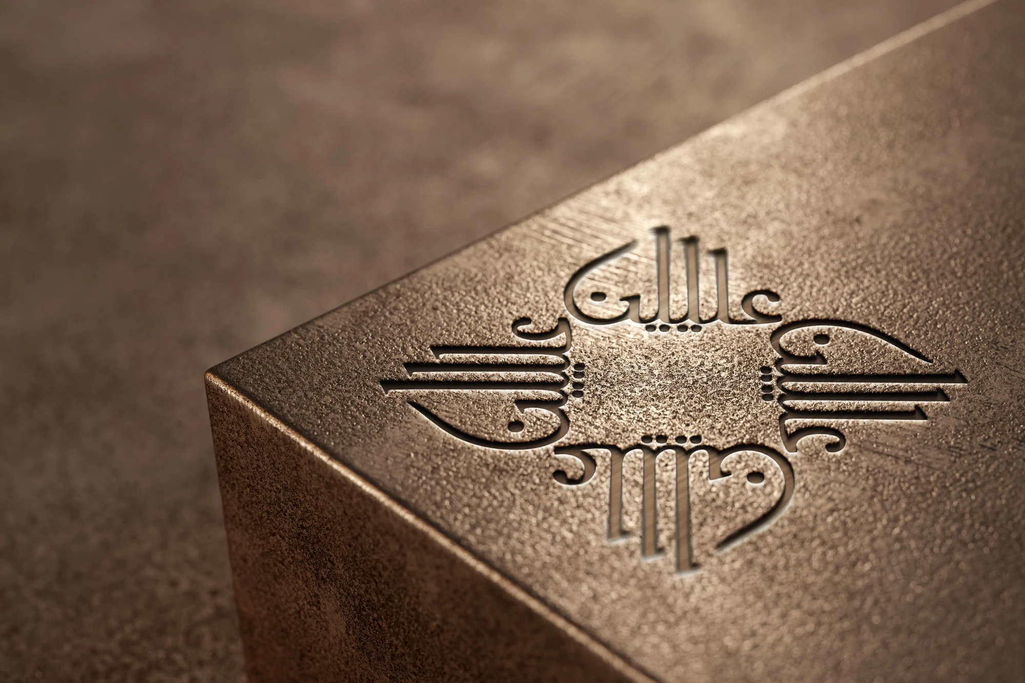
When translated onto fabric, the calligraphy gains a second role. Repeated across borders and trims, it becomes part of the style structure, framing key areas without overwhelming the presentation. This approach allows the symbol to remain identifiable while adapting to different colours, fabrics, and compositions.
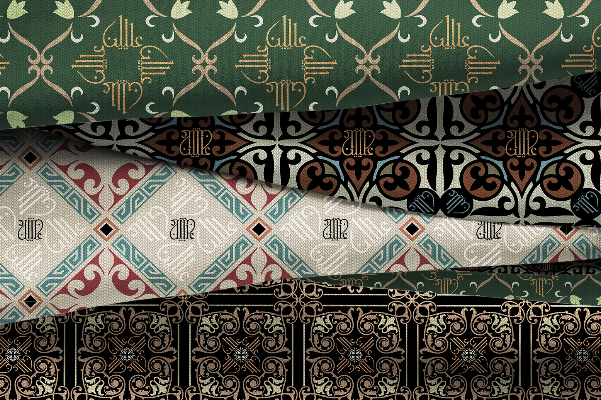
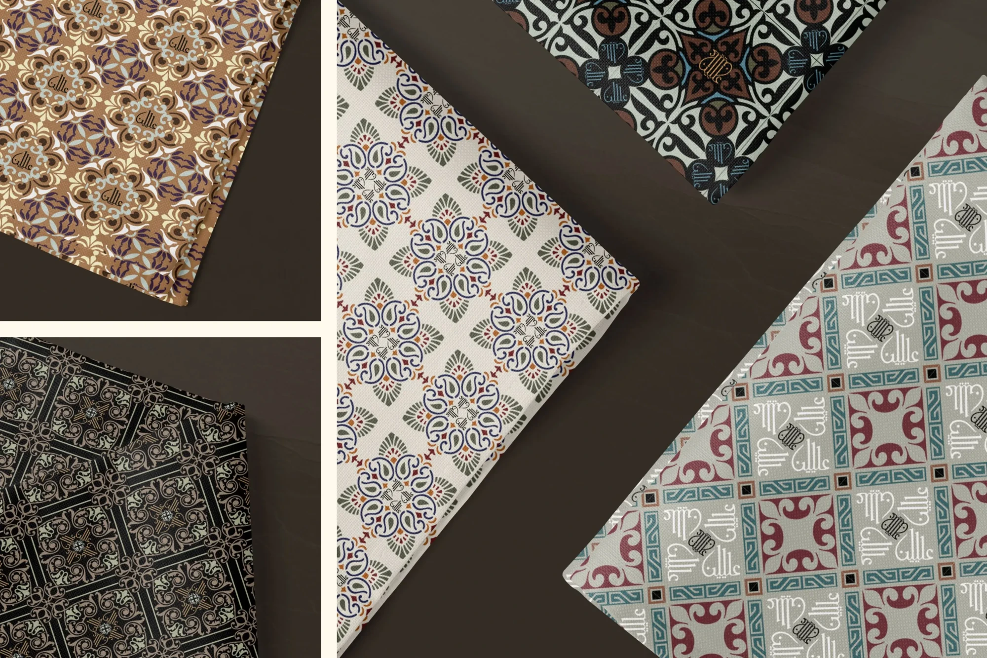
The Monogram Edition
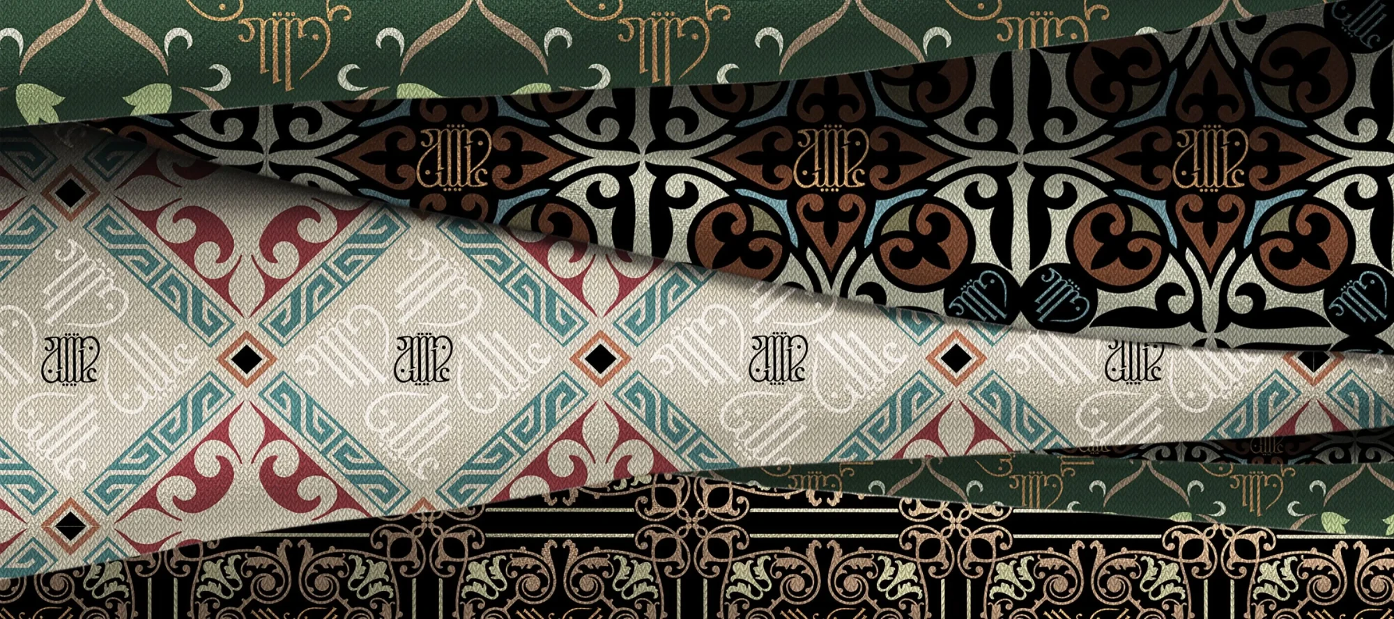
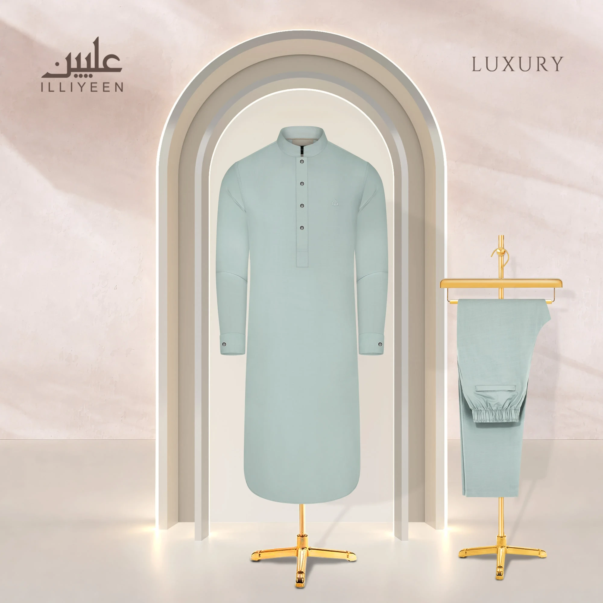
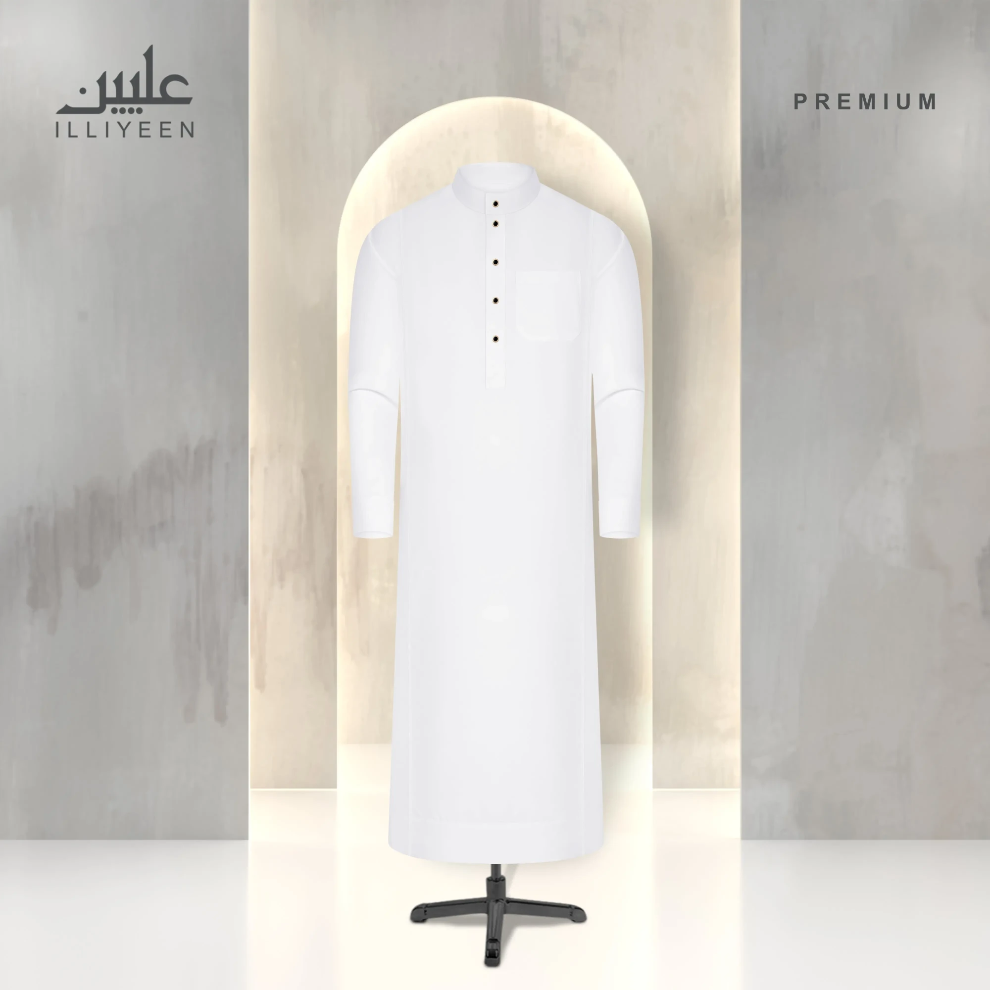
Across the collection, the monogram takes several forms while maintaining a shared structure. Circular medallion arrangements appear in lighter attire, combining interlocked letterforms with various decorative framing. Darker styles introduce denser compositions, where repeated elements create depth around the neckline. Another variation extends the pattern down the placket, aligning the collar, buttons, and sleeve edges into one continuous visual line.
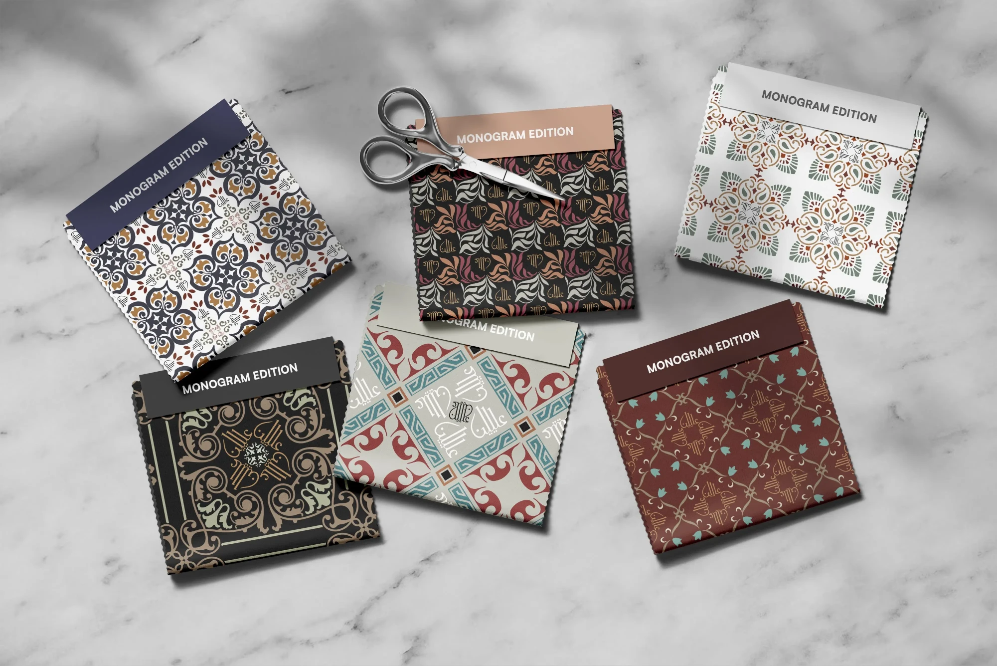
Colour plays a supporting role. A bright base amplifies contrast, allowing the artistry to stand out. Maroon absorbs light, increasing the pattern’s density. Neutral tones soften transitions between print and fabric, making the mark feel integrated. Each variation changes mood without breaking continuity.
Design Elements and Details
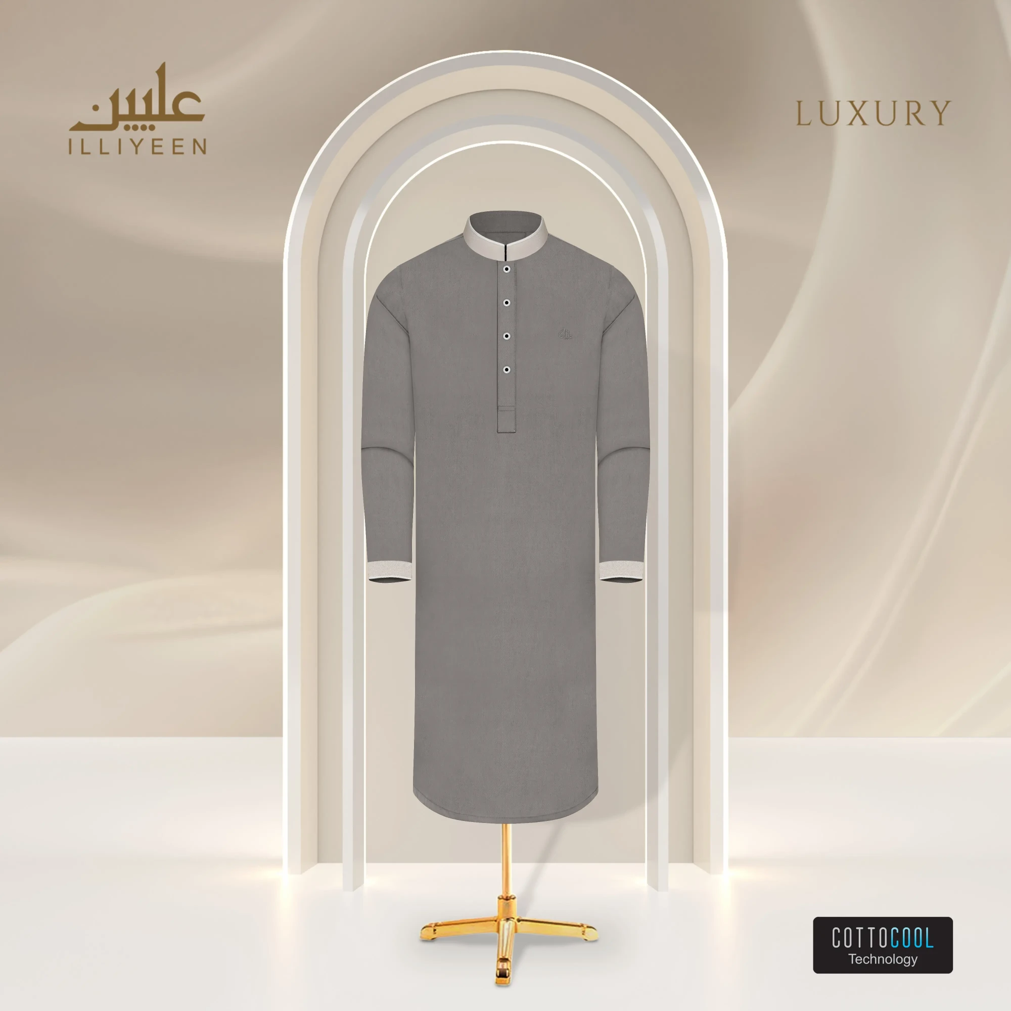
Placement plays a central role in how the designs are experienced. The Monogram appears near areas that naturally draw attention — the neckline, the placket and the hands — allowing the pattern to emerge and dominate the entire silhouette.
Pattern structures vary across the collection. Lattices emphasise symmetry, smaller repeating units introduce rhythm, and vertical arrangements guide the eye downward along the front. All derive from the same typographic origin, where letters evolve into geometric form.
Close viewing reveals careful coordination between print and construction. Button finishes respond to surrounding tones, supporting the overall composition without competing with it.
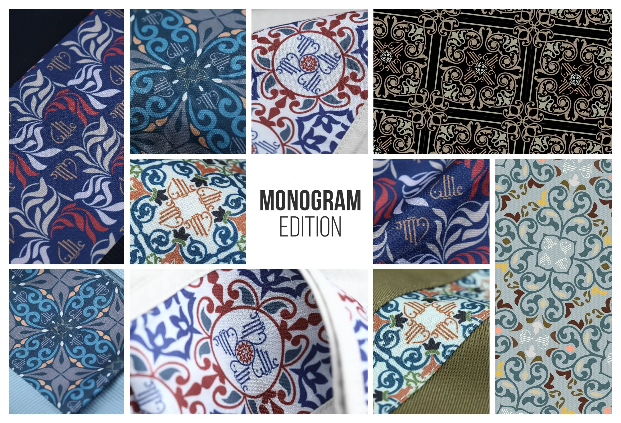
Fabric texture changes how the monogram appears under light. These adjustments demonstrate how repetition can remain controlled without becoming predictable.
What lingers after moving through the collection is a distinct character. The detail becomes memorable in each outfit, allowing individuality to remain intact. In the end, the appeal lies in ownership. The Monogram Edition invites the owner into that identity of something personal and distinctive without effort. The collection reveals itself through wear, through time, and through a unique perception that deepens gradually. Design gives way to familiarity, and in familiarity, this often marks the beginning of a refreshing style statement.


Yah all gd i like it
Good design
Very informative and helpful for all of us
Beautiful 😻